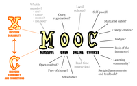
Photo from wikipedia
Along with significant opportunities, Massively Open Online Courses (MOOCs) provide major challenges to students (keeping track of course materials and effectively interacting with teachers and fellow students), teachers (managing thousands… Click to show full abstract
Along with significant opportunities, Massively Open Online Courses (MOOCs) provide major challenges to students (keeping track of course materials and effectively interacting with teachers and fellow students), teachers (managing thousands of students and supporting their learning progress), researchers (understanding how students interact with materials and each other), and MOOC platform developers (supporting effective course design and delivery in a scalable way). This article demonstrates the use of data analysis and visualization as a means to empower students, teachers, researchers, and platform developers by making large volumes of data easy to understand. First, we introduce the insight needs of different stakeholder groups. Second, we compare the wide variety of data provided by major MOOC platforms. Third, we present a novel framework that distinguishes visualizations by the type of questions they answer. We then review the state of the art MOOC visual analytics using a tabulation of stakeholder needs versus visual analytics workflow types. Finally, we present new data analysis and visualization workflows for statistical, geospatial, and topical insights. The workflows have been optimized and validated in the Information Visualization MOOC (IVMOOC) annually taught at Indiana University since 2013. All workflows, sample data, and visualizations are provided at http://cns.iu.edu/2016-MOOCVis.html.
Journal Title: Journal of the Association for Information Science and Technology
Year Published: 2017
Link to full text (if available)
Share on Social Media: Sign Up to like & get
recommendations!